[vc_row][vc_column width=”1/1″ css=”.vc_custom_1412163932564{padding-top: 90px !important;padding-bottom: 50px !important;}”][vc_column_text]
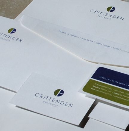
Crittenden Financial
[/vc_column_text][vc_row_inner][vc_column_inner width=”1/1″][vc_column_text]
Crittenden Financial was run by a husband and wife team who specialized in dealing with purchase orders. They would manage, write and negotiate POs on behalf of their clients. There were three parts to a whole transaction, which is why the C is also a pie split into three parts. There’s the buyer of goods or services, the seller of said items, and the middle-man. The logo also subtly contains a C and an F. I developed the identity and the stationery system and the client was very pleased with the end results.
[/vc_column_text][/vc_column_inner][/vc_row_inner][/vc_column][/vc_row]
Leave a Reply